12:45

American Splendor

American Splendor

The image above is from Art of the Titles and its shows nine key frames from the opening sequence of American Splendor. I looked at this opening sequence as it is very similar to the way I want to layout my opening titles. It's a mixture of real shots and comic book images which works really well but with my sequence, I want to just use comic images for most of it and one real image at the end and this opening will help me get to what I want. 

12:22

Feedback on Blog

We all received feedback from one person in our class, about what they thought of our blogs and what we could do to improve it. 

Mike gave me feedback, which was :

"Following from reading the blog, i thought that it was very well done. A good range of images and videoes instead of it just being text. The blogs were very informative. Some of the posts weren't needed, such as the concept one, as it just explained 3 other posts into one. Overall, i thought it was a well made blog, but there are some minor things that may need tweaking."

I thought, overall, that this feedback was quite good. Mike thought that it was quite good and only needed a few little bits of tweaking. I will find out what sort of thing should be tweaked and then do what is needed to make it better. 

07:59

My Production Logo

12:39

Concept Art

Planning for story board this week. 


Firstly, we collected images which would set the mood of our sequence and also some images which we thought were laid out similar to the way in which we wanted our sequence to be. These images were gathered together and we used them to create a moodboard. To create my moodboard, I used FinalCut, collected all the images, pasted them there and then added effects to make each image fade in and out into the next image and also zoom in. This final moodboard was then made into a quicktime and uploaded to youtube and blogger. 

After the moodboard, we made nine key frames which were nine still shots that would appear throughout my opening sequence. Creating these shots were useful as they gave me an idea of proportion and how things would look throughout my opening sequence. Also, by drawing these, I would know which images would have which effects, for example, which images would zoom in or be a long shot etc. The nine frames also make me think in more detail, they help me see in great detail what things would go where and how exactly I would want them to go. 

Finally, we made three film stills, which were taken from my nine key frames. We adapted these shots and joined them with some of the pictures we used for our moodboards. For example, we would take an image which was laid out how we wanted one of our shots to be like and then draw one of our film still in this way. We created three of these and each one was drawn in a different angle, for example, a close-up or a long shot. 
These shot helped me more than the key frames because it made me draw them in more detail therefore I could see clearer how things would lay out and what I would want to do. I think if i did each other my story board shots this way, I would get a very clear idea of what would come out of it all and what I would want to change but it would take too long to complete it that way. 

03:59

Three Story Board Frames

This image below is of three frames, which I have taken from my nine shots and then drawn in the style similar to three of my moodboard images. 
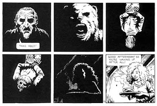
My first shot it a close-up of a picture within a comic book. The man in the shot is meant to be a doctor and he is telling the coma victims family about the situation. 

The second shot is of an angled close-up, again of a comic book picture and the image is of the coma victim in his hospital bed and a few darkened images from other parts of the comic. 
Finally, the third shot is of a comic book slowly zooming in closer and closer and eventually it will show another image from within the comic book.

03:20

Nine Key Frame Ideas

The image below is of nine key frames, which I intend to have throughout my opening sequence. The images give you proportion of where things will be and how much space a character or an object has. They can show you wether a shot is a close up or a zoom in and in my case a lot of them are. 


11:24

Opening Sequence for Film Project - shot ideas

In class we made a timeline to layout what ideas we have so far, where they would come in to the sequence and what shots went where etc. Here is a rough version of my ideas for my shots throughout the opening. 


All of the shots with images in off comic books are going to have the titles on the same page as the image 

- First shot of a heart rate monitor, flashing, moving alone and beeping in time with a patients heart beats. Dialogue over this shot, stating facts about coma's etc
 
- I think after this shot I will have a shot of the title of the film, Coma, and just have it plan white on a black back ground but I'm not sure of wether I will keep that idea

The following images will be in black and white 

- a fade out of the heart monitor and a fade in of a comic book page - picture of male in hospital bed

-a shot of a doctor explaining the males coma status, this images is on a comic book page - not sure what effect to place on this one

- zoom in of another comic book - starting from whole book - zooming in on pictures of male being nursed in the hospital or maybe police officers around his bed 

- maybe a slide in of a comic book page - double page - close up of two images - both hospital related again, male waking up from coma, and being tended to by nurses 

- a shot of the accident, which put the male into the coma but not too much detail so not much is given away, again on a comic book and probably a close up 

The next following images will be in a warm colour - suggesting a love relationship with someone

- picture of male with a past partner, maybe wife, in field and impression of him spinning her around 

- maybe a shot of him and his partner kissing or something along those lines to show the strong relationship they had - the deep love and again on comic book page

- a comic book picture of male caring for his partner, maybe two pictures on one page

-  a comic book image of the both of them at some sort of event, like a gig or some sort of activity - enjoying each other company 

Shots now go back to being black and white - setting a mood of sadness, loneliness and darkness

- another image of the accident which put the male into the coma

- a image showing a dark figure standing above the male, the figure is blacked out so you cant tell who it is and what they look like and then maybe on the page next to it, the figure walking away

- image of his partner visiting the male in the hospital - male asleep

- image of male waking after his partner has left - maybe on opposite page as the shot above

This is as far as I have got with my ideas of shots throughout the sequence but I think I'm almost there with what I want to do. The last though, will be of the male in his hospital bed and it fades out of the comic book effect and then into a real shot - I have to work on how I will do this shot though.

All of the shots above will have the credits on the comic book page - as if written on the actually book. 

All of the images in the shot will be shown as drawn comic book strips and have some sort of effect to slide in, zoom or some sort of effect like this. 

07:18

Moviestorm practice


07:17

Moodboard - in motion

11:41

moodboard - more images and fonts

These pictures show more font titles which I think would suit well in my opening and I also like the picture and layout which appear on the front of the DVD.
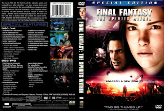
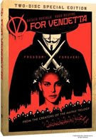
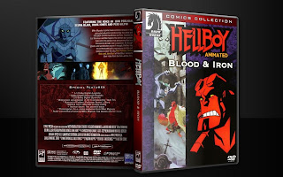
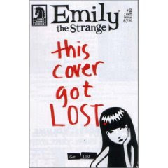


This picture, I think has a good and suitable font. I would want to use something similar to this, if I didn't end up using a 'typical' comic book font. 


10:47

Moodboard - Images to set mood

The first mood I am showing and wanting to set is mysterious, as my character is very mysterious and I think that this mood is very important within my film and should be shown in the opening. 
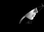

I chose this picture because as well as being in black and white, it sets a mood of mysterious, a women with hardly any detail and hidden in a way. This is very mysterious and almost exactly what I want my character to be portrayed as in the film. 


This picture shows a slightly different mysterious mood. Its more of someone being evil and mysterious from certain people, more of what you would see in films, which may come in useful. 


The next mood I want to set is anger, this i because it shows my main characters emotion in the beginning of the film and should defiantly be shown in the opening, as he later will 'run' on his anger and revenge. 

These two pictures show a very strong emotion of anger and pain. If I were to show this in a comic book form and with my character, it would fit nicely into my opening sequence.


The last mood I wanted to set was sadness. This will show the twist to the end of the movie but without reveling it and also his feelings from the beginning. 

I chose this picture as it shows an obvious sadness and seems to be hand drawn so I can see what the sort of mood could be portrayed as in my opening and how it could fit. 


13:27

moodboard - images 2

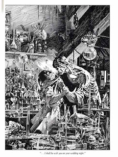
These pictures below are inspiration for colours, more than layout or mood. When creating my opening, I want to have a comic book theme and design but have it in a black and white theme, which in a way sets a mood of darkness, loneliness and evil. 


This last image below is drawn in a slightly different way and  I would like to find out how to to do this effect, as it sets a dark and mysterious mood and would suit well with my opening.


13:20

Moodboard - Images

Here are a few images for my moodboard, which I may use for inspiration, when creating my opening sequence. These images are similar to the way I want to lay out my opening sequence and they give me some ideas on what colour schemes I may use. 


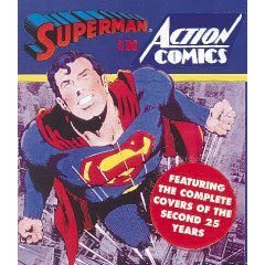
Comic Strip by cviviandesignaction comics 862 by istolethetvAction Comics #858 3 by jcurlee81Action Comics #858 4 by jcurlee81Action Comics #1, page 20 - the first page of the Zatara story by Gary Dunaier

12:21

Moodboard - Font Ideas

Here are a few comic font which I Thought would be good for my titles sequence - http://www.urbanfonts.com/fonts/comic-fonts.htm
I thought that these fonts would be good as they look a bit like they would be used in a comic strip and for my sequence I am thinking about making a comic strip which runs across the screen. These are comic fonts and are interesting fonts to use for my sequence.




01:50

Pitch of Brief One and Tagline

Pitch - Average male wakes from a coma to discover he has power to read other minds, whilst having flashbacks of his attempted murderer, he decides to get his revenge but his flashbacks reveal that the person may be someone close to him. 


'Memento' meets 'Bourne Identity' 

Title - Coma

01:43

Some Essential Elements to a good Opening sequence

- Eye catching imagery and showing off values

- related images and soundtrack - something which draws people in to watching the rest of the movie
- not to let the opening to drag out too long or it will lose viewers attention but not too short either
- don't introduce too many characters, try to leave something for surprise
- an appropriate order of titles and have name of film at the beginning or roughly close to that
- a unique story line, something original, not used before

12:45

Catch Me If You Can - another good opening sequence


I love the animation effects used in this opening, I think after looking at a lot of different kinds of animation openings, I have decided to do the first brief. All of these animations have been giving me a lot of inspiration and have given some ideas on what I would want to do with my opening, when it comes to making it. 
This animation is quite different to others which I have looked at. Most of the other animations have been comics, silhouettes or something quite similar. These pictures used are silhouettes but they are used in a way that looks as if it could have been a cartoon. It seem quite comical but very clever at the same time. 

11:16

Industry Analysis - Prologue Films

When starting this task, I looked at the 'Art of the Titles' website to find some agencies or studios which I think have done some good opening sequences. Prologue Films are a titles company who have worked on films such as, 'Iron Man', 'Bewitched', 'House of Wax' and 'Fred Claus'. This is one thing I like about company, that they work on a variety of different genre films and don't just focus their talent on one kind. As well as working on different genre of films, they also use a range of different effects to complete each. For example, when they worked on House of Wax, they used a waxy effect suitably and just worked on the title but when they worked on Iron Man they used an effect which looks like digital plan of the ironman. The range of effects go from comic effects to real footage from the movie, this my main reason to like this company. 

Prologue films have also worked on television openings as well, most of these have been programs off the MTV channel and especially for the MTV awards. As well as making openings for programs, they have also made quite a lot of commercials.
One of their openings which I like quite a lot is the titles sequence for 'Kiss kiss bang bang', the way the animation is done with simple silhouettes of women and just two main colours, red and black, it reminds me a bit of the titles for James Bond movies. I think this is a good effect and works well with the theme of the movie and shows a lot which is to come - a good insight. 

Kiss Kiss Bang Bang


The next sequence they have done which I want to show is for the film 'The Reaping'. I really like this opening, I think, in my opinion, it is the best sequence they have done. I like how they have managed to get perfect close ups of images relating to the movie, they work very well and show the medical, dark and death side of the movie. In most openings, I don't think blood works very well but in this case it is used subtly and just about works with the rest of the images to set the mood. These effects look quite complicated but I would love to try this effect one day with a opening sequence. 

The Reaping


Another example of one of their good sequences, is 'Zathura'. It is done in a comic still, is slow paced, panning across pictures and looks like a comic out of a book rather than a magazine. This is also another example of how varied their effects are and how many different genres they do. I like this one because when most people use a comic strip for a opening sequence, they use pictures from a comic magazine and have them flickering down and across the screen. To use different kind of images and use them in a different way, gives a better effect and more of an interests goes to the rest of the film. 


Zathura

14:41

Brief One - Comparative Analysis - Comparing

Both of these films were based on Marvel comics but their opening sequences are quite different. The opening sequence of  'Dragon Tiger Gate' starts off with literally a comic book sketch running and flickering down and across the screen, showing part of the story of film and giving a bit of an insight for the viewers to see. This gives a great effect and instantly shows the viewer the genre of the film and what it is roughly about. The way in which this portrayed also a sense of chaos and the reason I say this is because the comic strips are down really fast, especially in comparison to the other opening. After a few seconds of the flickering comic strips, the camera slows down and the last part of the picture slides across and the picture blurs out. I think this effect is really effective, works well with the theme of the movie and is something I think I would try to do with my opening, its a great effect. The rest of the opening titles are flying across the screen on roughly the same background, for the rest of the sequence. Even though they are flying across the screen, the way they are put across the screen is done in a bold way, just like an action comic - its almost ideal and works well with the comic background. 

'The Punisher' on the other hand, is quite different in the way in which they use their effects to create an opening sequence. The effects are done in a sort of drawn style but not like a comic strip and this is why I think I like this one as much the other and that even though they used the same sort of idea and genre, it still looks completely different. As well as looking different with the pictures, it also is down in a slower speed which sets a calmer or more depressing mood, as if the story is a sad one. 
The sequence starts of with the marvel logo and bullets going through it and this logo, along with the rest of the opening titles, is made in a black and white effect. As well as being in black and white, the whole sequence is also in slow motion, which I think gives a sort of matrix effect and work well with the idea of war - which shows the story of the film. A few more different picture appear sliding down the screen, just like the bullets, such as blood running down the screen. 
When the title of the film appears on the screen, a picture of a skull appears with the title, this shows the idea of evil and again, war. It is so simple but really effective when trying to show what the film would be about and it shows the audience a lot about film. Most people find black and white very boring but I think the most simple things tend to be the most effective and in this case very effective. In comparison to the other opening sequence, this opening is the complete opposite and when chose what kind of thing I'd like to create, I would go for either one of these ideas because the give me a lot of inspiration. 
Overall, these opening sequences seem quite a like but they are completely different when looking at the effects they used to open the movie with. One shows this in a comic book strip style and the other is in a sketch style but more of an animation than a strip. These are two different techniques I could look at and get two different outcomes from the opening sequence I eventually complete. 

03:42

Long Road Logo - using after effects


To create this logo, I used photoshop and 'after effects' software and a few techniques within it. Firstly, I cut each part of the logo out of the picture so each part was by it's self and put each part into after effects to create the moving logo. 

Once it was all in after effects and in the right place, I played around with the positions of where each part of the logo starts off and the played with the end point and fixed it. I dragged each part of the logo out of the frame, mostly diagonally so that they fly in all together and create the logo. 
After I finished that, I made the logo fade out at the end and to do this I changed the opacity so that it faded out at the end of the animation. 
Finally, I changed the animation to 'quicktime' and the uploaded it to youtube and then to my blog. 

11:15

Brief One - Comparative Analysis - Structure

I haven't yet decided on which brief I am finally going to do so I am going to compare two briefs and each with two films. 


The first opening sequence I am going to compare is a Korean action called Dragon Tiger Gate, based on a comic book. 


Mandarin Film Distribution Co Ltd.
Beiijing Polybana Film Distribution Co Ltd.
Shanghai Film Group Corporation 
Present
A Mandarin Film Ltd. Production
Executive Producers Raymond Wong, Li nan, Ren Zhonglun
Adapted from Comic Series "Dragon and Tiger Heros" by Wong Luk-Long
Donnie Yen, Nicholas TSE
Shawn Yue, Dong Jie, Li Xiao-Ran
Produced by Raymond Wong, Nansun Shi, Xu Pengle, Yu Dong
Co-Producer Donnie Yen
Action Director Donnie Yen
Director YIP Wai Shun


The second film I am going to compare is The punisher, based on a Marvel comic book. 

(these titles are a mix between the beginning of the film and the end, as the beginning only has part of the titles and the rest is at the end)

Lion Gate Entertainment Presents
In Association with Marvel Enterprises
A Valhalla Motion Pictures Production
The Punisher

Directed by Jonathan Bensleigh
Written by Jonathan Bensleigh and Michael France
Based on the Marvel Comic book Creation
Produced by Avi Arad
Produced by Gale Anne Hurd
Executive Producers Stan Lee, Kevin Feige, John Starke
Executive Producers Andreas Scemid, Christopher Roberts, Christopher Eberts
Co-Producers Avi Arad, Andreas Grosch
Associate Producers Anson Downes, Linda Favila
Director of Photography Conrad W.Hall
Production Designer Michael Z. Hanan
Edited by Steven Kemper, Jeff Gullo
Costume Designer Lisa Tomczeszyn
Music Supervision David Jordan
Music by Carlo Siliotto
Casting by Pam Dexon
Tom Jane
John Travolta

01:48

Feedback from Brief Ideas

I pitched my ideas to four other class mates and this is the feedback which they have given me.  

Brief 1
In general, the group liked the twist to my idea, could do with more, they thought it was planned quite well but they thought I should have a twist with the coma, more of him hearing voices, than reading minds. 
They thought t was a good idea but if not thought through carefully, it could become confusing. 

Brief 2 
When hearing this brief, they said it was planned well, was similar to 'Silent Hill' and is a good idea. They thought it would be good if there was another room that the mother can go into to read about the history, e.g a library. "It will be awesome when a bit more scary". "Could be made more brutal".

Brief 3
With brief 3 they said they liked the monologue idea but some of them thought the homeless idea may not work too well, then again some thought it was a good idea. They thought it was very informative, should work quite well and seems fine how it is, needs a little more but they don't know what. 

Brief 4
For this one they thought it was quite good, would be very graphic but they don't think they should forget their issues, it should be chaotic and should try find a cure for the plague. They also think that people would watch and that it would be quite entertaining.  "Again, more brutal, the better!".

09:55

Brief Four - Animated feature appealing to adults based on fictional novel

It's 2020 and the government has failed to work, the monarchy has been killed off and its now all about survival. North verses south, town verses town and country verses country. England has become the land of all out war but an outbreak of a deadly plague, starting off in the north east and central London, makes a lot of people forget their war issues. 

09:39

Brief Three - Independent movie featuring young character

Male aged 18-20 has lost everything, is homeless in Britain and has to rough it out till he is able to sort out his life and live normally again. The movie is done in the character's view, his own monologue.

09:35

Brief Two - Supernatural thriller appealing to females

Mother and child move into a new house, child find entrance to old torture dungeons and is taken by the ghost which haunt the torture rooms. Mother reads through history of the place to try and defeat the ghost and gain her child back to her safety. 


09:03

Brief One - Mainstream action - based on fictional comic

Average male wakes from a coma with memory loss, eventually finds out he has the power to read others minds and  begins to try and find the person who put him in the coma, not to know that it may be someone who used to be close to him....

13:17

Strengths and Weaknesses of R2 - 50 blog and video

My first thoughts about the blog were that it looked and is very detailed and when reading through the blog I can see that they understand what they planned to do and how they were going to complete it. For example, when writing the plan they went through each part of the task explaining what they intending to do, such as, 'initial ideas', 'title ideas', 'character, prop and location'. 

On a negative side, even though what they did write for the plan was detailed, they could have writing a bit more about other aspects of task in their plan, such as, what they were going to shoot, any affects or editing they knew they wanted to do etc. 
When completing the research part of the task, they did quite well, it was detailed and they researched two film sequences and referred to 'the odd thing' when planning and evaluating. 
At the same time, I don't they did as well as they could with the research and with the number of people in the group, they could have research a lot more film or other things which were relevant. 
Overall, I think they did really well with the blog, they really put some thought into it and they all seemed to have a good idea on what they wanted to achieve. 

As a whole, I didn't really think the video is a good as they could have made it, based on what they were able to do in their plan and research. The first thing which I didn't like was the flickering of the shot of the close up of the main characters eye. I thought the flickering was out of time and should have been timed with either the eye-lid closing or opening, rather than random flicks. This would have made a better affect and it wouldn't look like they just flicked it any way they felt. 
The next part of the video, I quite like, it shows flickering between different images which the boy on the bench is remembering. In this case, the flickering works and gives the best affect in the video. It is the most professional 'looking' part of the video. 
When watching the video, you can tell that the camera is hand held and it shows obvious shake and unbalance. This makes the video look like it either has bad affects or that they aren't used to the camera. Instead of holding the camera in these shots, they could have hand the camera stand and moved the camera or had the camera person on some sort of moving object, such as a wheelchair. 
The rest of the camera shots, fades and pans up are quite good and give a good affects to the change of character. The fade, I specifically liked, it was the a right spend and in my opinion, it was the only thrilling part of the video. 

13:59


This is the video I chose from the selection of Hurtwood House videos. I chose this one mainly because I find the part of the story, which they have shown in the opening credits, very interesting and it makes you want to keep watching to find out why the women is constantly trying to washing off blood and dirt which isn't there. I like the way they have made the shot jump images of one thing to the next, for example, seeing the dirt on her hand and then not but this process happening repeatedly. Also the beginning of the video is my favourite part. It's interesting and grips when you see the beginning start with you seeing part of someone's face and just an eye moving and opening. Along with the camera switches between shots, this makes it a good opening to watch and it pulls you in, creeps you out a little but enough to keep you intrigued to watch the rest. 

13:04

Austin Powers 2 - Studio and Production Companies

The video, which I have pasted on to my blog page doesn't have any mention of studios or production companies but they are mentioned a few minutes the main opening credits. The ones which I found were 'New Line Cinema'(studio and production company) and 'Eric's Boy, Moving Pictures and Team Todd'(production company who went to New Line Cinema). 


This is the Logo for New Line Cinema. 


In 1967, Bob Shaye made New Line, when he was 27, with the idea to get into the market of foreign and art films in the college campuses. 
As you can imagine, New Line have done many films, as they are a big name but their most recent films are, 'Journey to the Centre of the Earth', 'Four Christmases and 'Friday the 13th'. 
And for programs, I haven't managed to find much about tv programs which they may have been involved in. 

12:57

Continuity Task

13:28

Opening Titles for Austin Powers, The Spy Who Shagged Me


I chose the titles sequence for the second Austin Powers film. The main reason I chose this sequence is because of the way they have made the titles to fit with the theme and story of the film. The titles are suggestively placed, covering Mike Myers lower half while he parades naked, around a posh hotel. These titles fit with the story and theme, as they are in a 60's style font and of course the placing of the text. This fits because Austin is 'player' from the 60's, who, as a player, likes to be with a lot of different women. I find this part of sequence quite interesting, as I've never seen this sort of thing done in a title sequence before, along with being very entertaining, it is also quite clever in the in which it is done. The title appear in the place and then are bounced and swung around in the direction in which Austin moves around.

 
The sound is good but is quite predictable, so I don't find this part too interesting. The music is 60's themed music of course and there isn't much more sound other than Austin's voice and some women screaming occasionally. 

I find the editing in this sequence interesting as the most obvious editing which has taken place is the editing out of Austin's lower half so you don't see anything you shouldn't. At some point in the sequence, they have slipped up a little bit - if you pay close attention when watching him as he goes around the food table, when they take certain objects away and place another, you can see a slight dark patch which is his fluffy underpants he wore during the making and which they should have edited out. 

The camerawork is quite simple, it mainly just follows Austin around the house, making sure most of Austin's body is in shot. There are a few focuses on objects which are placed in front of Austin and then a focus back  to Austin. I think this is interesting and works very well with the impression the titles sequence is meant to give. The camera basically goes where ever Austin does, almost as if it is glued to a stick coming off his forehead. The final shots I do find interesting, as they show Austin being lifted on a platform, up from the water and appear in front of a lot of people celebrating. The camera pans up as Austin comes up, then the camera goes to a shot above Austin and the to front of him to show the celebration behind him. These shots show the character of Austin, how proud he is of himself and how he sees himself. I think it work very well, most people would find it a bit over the top but it is a perfect opening for the perfect, funny comedy. 

03:57

Opening Sequence for Film Project


In this video I have used a few different effects while making the video, such as, starting by fading the shots of the video in and out of the next shot and fading the names of actors, again out of each shot, basically by changing a setting and clicking the part i wish to fade and make a fading line. After this, I started on fading in the title of the film, by using the same technique, increasing the size of text as it comes in closer and then fading out again. This was done by selecting the title, changing a few settings in the box, which the video plays, decreasing the size, fixing that point and then repeating that when i make the title it's biggest. I really enjoyed making this sequence, especially the effects I used for the title of the film, I found it quite simple once I got used to it. 

12:49

CSI Miami Lego Shot by Shot

(I was only there to complete the first two shots in the sequence so most of this analysis will be done by what i've seen watching the sequence and what my other group members told me.)

The beginning of the sequence shows a very quick shot of the city Miami, its about a 2 second shot so it wasn't hard to do but it did take us while to makes the city out of lego and i'm sure fans of show will recognize the shot as Miami.
The next shot we did was of two men, one being the lead male character in the show, speeding down a river in Miami. This shot shows the action that appears within the show, as a insight to what excitement the viewer will witness. Being a viewer of CSI myself, i find this shot in the opening sequence to work very well when showing the best parts of the show and i think we were able to do the same with the Lego and i think people will recognize the shot from the original.
The next two shot are close ups of the main male lead and one of his colleges. This gives the audience a chance to see the main characters before watching the show and gives them a few seconds to judge - judge what they think of the characters personalities or what they look like. Even though lots of people don't like to judge a book by its covers, when watching tv shows, thats what most people do when they determine wether they will watch the show.
Shot four in the sequence i think is my favourite because its a pan of the Miami city and i found it the most fun to complete the set for it and i think this is what a lot of people will recognize, especially with the camera work. The pan goes up the city, going along the side of the beach and show the glamour of show and beauty of the setting.
The next five shots that follow again are just showing the characters which appear within the show and again give the audience a change to judge the characters for themselves and see what each one does in the program. Along with showing the characters on there own, the opening sequence shows the characters dealing with technical equipment, tests in the lap and other things which go on when on the job. For example, we completed a shot of a dad body on a autopsy table and this was very interesting to try and figure out how to get it to look and work properly.
After most of the shots of the characters, we have another shot of the city miami, only for a second and then a shot of some of the characters in the strip joint watching a stripper.In the shot you see a strippers legs walking past the screen and we decided out of the blue, just for entertainment that we would make one of the legs a wooden leg. It happened to work really well, it was hilarious to see in Lego and i'm people who recognize the show from the shot will find this shot very funny.
After a few more shots of the characters, we show a shot of the city again slowly panning up the city, quite similar to a shot earlier in the sequence which again is another favourite shot of mine and again gives the audience a last view of the setting of the program.
Finally, the last shot is the main lead again but he appears in the shot faces away from the camera with his back to it. This shows the audience that he has some secrets and some troubles of his own and that during the show there will be some scene showing the lives of the characters and relationships between them. It is a very strong shot and appears very meaningful.