Showing posts with label opening sequence. Show all posts
03:33

Continuity Task and My sequence - Looking back at your preliminary task, what do you feel you have learnt in the progression from it to full product?

We had a task to re-do our continuity task for the film project. From the task I learnt and remembered 180 rule and that where the camera is on certain parts of the sequence, really matters. I learnt that during a conversation between two characters, the camera should be showing both the characters when they speak or if not you can have the camera of the characters reaction to the other talking.

The 180 rule is the the camera should stay on the same side of the two characters having a conversation and not change from that throughout the conversation. 
The sequence also has to visually make sense. for example, when someone opens a door you should see the characters hand go to push the handle down and then see on the other side of the door opening it the rest of the way and coming into the room. 

However, with my sequence there was no need to use these rules within my sequence. This is because my sequence is basically just a montage of comic book pages and a one shot piece of footage at the end of the sequence. Therefore, no rules were needed to be taken into account. 

01:19

Similarities - How does your media product represent particular social groups?


My task was to compare one of my shots, which included my actor within it, with another shot from another movie. I close my only shot of my character, which is a zoom in of him in a hospital bed and still in his coma. I have chosen to compare it to a shot out of the film 'Awake'. The shot shows the character under anesthetic and with all the medical equipment plugged into his body. 

Similarities and Differences

1) The shot is roughly the same to my shot, even though it is at a slightly different angle, it still shows the same principle. Both of the shots are taken from the right side of the body(as if you were viewing from head first) and shows the patients head on the right hand side of the frame.  

2) The equipment in the shot which I have taken from the film Awake is not in my shot, as I couldn't get hold of the equipment and it wasn't suitable for the shot as the actor is about to wake from the coma. On the other hand, my costume is quite similar, as both of the two actors are wearing white t-shirts, which is suitable costume for a patient. 

One big difference is what each of the characters roles were. The character from my film is meant to be waking from a coma, after that shot, and he discovers he has 'super' powers. However, the character from Awake, is having a heart transplant which is set up to be a murder rather than a real surgery. 


13:24

Key Frames - In what ways does your media product use, develop or challenge forms and conventions of real media products?

11:55

Nine Key Frames - Info

The image above is of my 9 key frames from my opening sequence. Each of my images which I have chosen, when in the moving sequence, show didn't forms and conventions which I have used. The first images shows my titles of my film and it also represents camera movement. This is because when it is in movement, it starts off small and it spins slowly whilst zooming in on the images and title. This probably my favourite camera movement and is the best example of one way in which I used the camera to make my opening sequence interesting. 

My second image is of a man in a hospital bed and the production companies on the image too. I have used this image because it is an example of typography. This is because it shows a clear view of one of my titles and it shows the text quite clearly. The text is in a sort of hand written kind of font called Marker Felt and I used this because it looked quite suitable for a comic book style. 
The third image is a close up of a doctor within my comic book. This is an example of framing because I used the camera to zoom in on a certain part of my image and I thought this certain frame would be a good example. 
My fourth image is an example of transitions because it shows an image of a dark figure looking at the main character standing on the edge of a building and that image starts off with seeing the dark figure and then slowly zooms out and pans down to see the whole image. I liked the way that this transition worked as it gave a good effect to what the image was trying to explain. 
The fifth image is a close up of the main character lying unconscious on the floor. I have used this image to show my narrative because it shows the main character how he got into his coma and him actually going into his coma, which I think shows a big part of the story. 
I have used image six to show the setting because it shows a flash back and I think it is a important setting to set as it shows the main characters past and how important it is to the story. As well as using this image, I could have also used the image above as that would have shown the setting for all of the other images too. 
My seventh image is to show vision and effects. I chose this image because it is one of my images which is meant to show a flash back to the characters love life before he went into a coma and I used some colours to change image so he represented love and a past time. I chose to do this because I wanted to make it obvious that it was meant to be a flash back and the red colour specifically was meant to represent the love between the two characters. 
The eighth image I have chosen is to show the lighting within my opening sequence. The lighting was a big part of my project as my opening was based on a comic so I made each image have a shading in the right places and made sure the colour showed a style of comic. The shading was also very good in making my images stand out and shading in the right places on the image of the dark figure, made the image more mysterious and dark. 
Finally, the ninth image I decided to use to show costume. It is my last shot within the sequence and shows a zoom in of the real character in a hospital bed. I used it for costume because it was really my only shot to show real costume and it shows it quite well, as he is in his hospital clothes and also in a hospital bed. The costume was quite easy to show, as it was basically a white t-shirt and a white blanket to cover the rest of the actors clothes. This costume was vital to my sequence as it was important to show that he was a patient and I wanted to give the same image as a real hospital scene. 


02:01

Feedback From Level 2 Group - Who would be the audience for your media product?

The level two group were given a sheet of questions to fill out, which would give us feedback on our sequences. Here are the questions and the feedback. 


What kind of genre do you think this film belongs to and why?
"Animated storyboard and a serious drama because the titles of the film is Coma and the music suggests this sort of style."

Who do you think the target audience of this film would be and why?
"Between the ages of 15 and 25 because its look sinister and the film needs to be understood properly but could be an enjoyable film if you were to make it."

What is your favourite image from the film and why?
"My favourite image is when the man is in the bed and it says HeartReel and Long Road Productions because it looks affective. I also like the image where it goes from comic to real footage." 

If you were to borrow one idea from this film for your own film-making project, what would it be and why?
"The music because it is very dramatic and it sets the suspense for the rest of film. I also like the fact that it is from a comic book and I draw cartoons for a hobby."

01:53

Feedback From Jake- Who would be the audience for your media product?

Jake and Jim came into our media class for one morning to see our opening sequences and give us feedback. The feedback the Jake gave me was that my sequence was a little bit slow and that you had to wait a while to get to see the titles of my film. He mentioned that I could zoom out of the picture a bit more so that we got to see the titles a bit quicker. 

I have taken in Jake's feedback and even though I can't change my video now, I will think about that sort of thing when doing future projects. 

01:52

Invoice Cloud Questions

Thing in which I think I could improve on and develop.

- I think I would benefit on improving a developing my skills on After Effects and I chose this because it was the software which I needed the most help with throughout my film opening project. 
- I think I could also develop my drawing skills, as when I was drawing my comic's during my project, I found it quite hard to draw comic images which actually looked like comic images. 
- I think I should also improve my planning and time keeping, as even though I had just enough time, I would have liked time test things out and see what worked a lot of times before I got a final version. 

Three people within the class that I did not assist during the project and how I could help them in future projects. 
Tara - I have improved my Final Cut skills throughout this project so I think my skills there may come in useful and with anyone really. 
Matt L - I could help him with music by seeing if my boyfriend(who made my music) could help him with his music because I got very good feedback from that piece of music. 
Allie - She is one person which I did not help but I don't think there is certain skill I could help her with but I could help anyone with using Comic Life software if they chose to use that. 

12:48

Invoice Cloud


The text below is the text which is in the picture above. ^^^^^^


This is my other invoice cloud which work pretty much the same way but this one is the other way around. The names within the cloud are people which I have helped with something which they needed help with, I would fill out the sheet with the job which I did for them and then they would give me feedback, Again, the text is bigger if I helped them a lot and the name is further away is they gave me bad feedback and so on.

12:31

Invoice Cloud


This is the text that is in the image above ^^^^

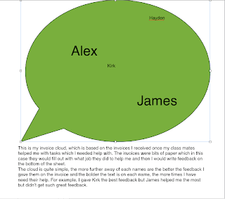
This is my invoice cloud, which is based on the invoices I received once my class mates helped me with tasks which I needed help with. The invoices were bits of paper which in this case they would fill out with what job they did to help me and then I would write feedback on the bottom of the sheet.
The cloud is quite simple, the more further away of each names are the better the feedback I gave them on the invoice and the bolder the text is on each name, the more times I have need their help. For example, I gave Kirk the best feedback but James helped me the most but didn’t get such great feedback.

12:31

Technologies - What have you learnt about technologies from the process of constructing this product

03:18

Technologies - How I Used Them - What have you learnt about technologies from the process of constructing this product?

In the picture above I have gathered all the items which I used within my project to complete my opening sequence. The the picture consists of camera's, both the HD camera and my digital camera, Mac's and head phones. I also added in all of the software which I used throughout the project, such as, Final Cut, Garage Band, Logic, Comic Life and also some websites like Art of the Title and Dafont . com. 


Firstly, I used my Mac to load up my comic drawings, once drawn and load them into the Comic Life software. Within the comic software I changed the colour of the drawing so they were in sepia sort of shade and then the images which were representing love, I then turned into a warm red/pink colour. As well as editing the colour of each image, I also put each of the images into ready made comic templates so that each page looked like it was taken from a real comic book. 

Next I started to put all of my comic pages into Final Cut and put them into their proper order so as you went through the opening you would be able to see a sort of story. Once they were in the right order, I then cut them down so they were all the same length in time but also not really long so people wouldn't get bored. Finally, I edited them so that they slide into each frame(which I ended up changing because it looked better if you saw each page as if you were reading the comic) and then I put fades on each ends of the images so that they flowed into each other well. 

After finishing most of the editing I thought I needed to do with my comics, I then went onto getting my production companies into the front of my sequence which wasn't hard at all really but I needed to use After Effects to edit my Long Road production logo, as at first it wouldn't load into Final Cut. 

I then started using the HD camera to film my only part of footage I needed. I found a first aid room at college which wasn't perfect but it was quite good for what I needed to do. Once I had permission to go into the room, I invoiced my class mate Hayden to help me with the zoom in of my actor Kirk, in the 'hospital bed'. It didn't take long at all and it ended up looking quite good. 

The next thing I had to do was to upload the footage I had taken to the Mac and then into Final Cut. It was the much simple part within my project to edit, as all I did was cut the parts out which were not relevant and then slot it into the end of my sequence. 

My music was the next thing which I had to put into my Final Cut file. I had to transfer it from my boyfriend's Mac, which he made on Logic and Garage Band software, to my Mac and slot it into the right place on my sequence. 

Youtube was my next thing I needed to use, to upload my rough cut to there, which is where I upload all of my video throughout my project. I also used the site Blogger to blog all of my project as I went through each part and is also were I put all my video too.

By this time my sequence was pretty much finished but I managed to get some feedback which really helped me and I editing a lot more of my sequence. The feedback took me back to the Comic Life software, as part of my feedback was to change my titles from flying on the screen, to actually being on the actually comic images. 

As well as using software and parts of technologies, I also went onto websites for research. These websites included Dafont.com and Art of the Title. 

13:22

Film Opening -With Commentary - What kind of media institution might distribute your media product and why? How did you attract/address your audience?


This is my film project opening sequence but with a sort of director's commentary over the top. In the commentary I tell you a bit about what I would do if I made the film, a little about the opening and what I would want the film be like once made, e.g what kind of audience. 

09:10

Evaluation Questions

In what ways does your media product use, develop or challenge forms and conventions of real media products? (i.e. of film openings)

Most of my inspiration was from the film 'American Splendor' and its opening sequence. I liked the way that the camera moved over the comic images and also the style of the comic images. When creating my comic's within 'ComicLife Magic', I tried to recreate the same style the comic's were in American Splendor, they were tinted brown, to give an old comic effect.


How does your media product represent particular social groups

My social group would probably be young adults and teenagers, most likely males. As my film is based on an action comic book and it involves someone waking from a coma to discover his powers, I think the social group I have stated above would fit well. 


What kind of media institution might distribute your media product and why?


An institution that might want to distribute my idea would be any who are interested in comic based movies and action ones to be specific. Maybe the same distribution as American Splendor but I would think who ever distributed films like Spider man, Batman or The Crow, just because these films are closer to what I wanted my film to be like. A man with a dark history but a life full of action. I think they would enjoy those two elements combined and thats what would 'make' the movie. 


Who would be the audience for your media product?

My audience would most likely be from the age of 15-16 to the age of 30 but it depends on what the person who viewed it would be interested in, as my film is an action film based on a comic book, i would expect people who are interested in action and comic book based films to be my audience. 


How did you attract/address your audience?

I attracted them by showing within the opening that it was obviously based on  a comic book, from when you see the first comic book image come into screen. I also showed a few images to suggested action will be involved. These images were of the silhouetted character, pushing the main character of the roof and then seeing him dead on the floor. 


What have you learnt about technologies from the process of constructing this product?

I have learnt that it takes more time and patients to create a finished product which looks professional and very visually clever or interesting. I felt like I need to produce a lot of versions of product before I got something which I liked and others thought were good to watch as well.
Working in Final Cut was fine but getting the images to work well with the titles was much harder than I thought it was going to be and in the end, I ended up putting the titles on the actual images and it look better than before. I think with making anything like I did with comic book images, trial and error is the best way to go, to make sure you have plenty of time to try things out to see if they work, get an opinion and then fiddle with it till it is perfect. I found with mine, that to do it right, was to get something good but to do it in a wrong way, was to get something which didn't look that great. 


Looking back at your preliminary task (the continuity editing task), what do you feel you have learnt in the progression from it to full product?

I think with mine it wouldn't make a huge amount but I think I did end up using it more than I thought. When making my footage for the end of the opening, I tried my best to take things out the shot which made it look more like a first aid room than a hospital room. As that shot was only a zoom in, I was precise in making sure the zoom in was only of a certain part of Kirk's body, starting from seeing his head to his lower legs, to just seeing his head. 
The rest of my sequence didn't really involve much continuity, but when making the image come in to frame, it turned out that having them come in from too many angles didn't fit well so making them read across a page made more sense. Also making sure the pictures were in the right order to tell the story with images correctly was a very important part. Without having them make sense, my sequence would be boring and quite pointless. 

08:47

Video Without Footage

The video below is my Coma video but a version of it without the last part of footage. A couple of people thought that my video would look better without the end footage but I decided in the end that myself and a lot of others preferred it to be included so it is now in my final version. This video below was made more for comparison between my final version and this version I could have had.


08:18

My Final Version - Coma


This my final version of my film opening project. I think it went quite well and turned out to be a good video, in my opinion. If I had another day to do this project, I think  I would probably use the extra time to play around with the order of my pictures and get some more opinions from others. As before I finished my project, there was a lot of debate on what order to put my picture in and whether to keep my end footage. I decided in the end to keep the end footage and I ended up changing the order of my pictures slightly and I think the end outcome is good. 

11:32

Constructive Criticism

"Dialogue could be bit louder, as music goes over voiceover" - For this I am planning to get rid of the voiceover all together as I think it is not really needed very much within my opening sequence. 


"Maybe have the comic's moving into shot, as if you were reading it" - I have decided to do this and also have the camera focused in on one part of the comic page and then move over to the main picture, where the titles appear. 

"Titles are often horrible placed on black parts of the pictures" - I will fix this by not actually having the titles outside of the comic at all but instead I am going to have them in a white box, within some pictures. 

"Varying the ways in which the comic's come into frame" - I will change this again by having them come in as if you were reading them and this way the comic's with come into shot in more simpler ways and varied. 

"Perhaps reduce the running to time to 1:30" - As I am getting rid of my voiceover all together, this will reduce my running time and will maybe be more interesting to watch. 

14:27

Draft of Opening Sequence


This is my draft version of my final video, for my opening sequence. So far, I think it has gone quite well and quite smoothly but there are a few things within this video above in which I need to edit before making it my final version. 
Firstly, I want edit part of the music, during the begin, where the voiceover appears there is a part where the person speaking is interrupted by part of the music being too loud and I want to edit this so that you can hear the voiceover that dame amount all the way through. This won't be too hard, as I just have to delete that part of the music from my soundtrack and then reload it into my final cut version of my video. 
The next part of my video which I need to edit or add to is the section at the beginning where the screen is blank during the voiceover. In this space, I am planning to make a heart rate monitor using AfterEffects and have that playing whilst the voiceover is playing. This shouldn't be to hard once I figure out how to make it but I intended to invoice one of my class mates or get help from a teacher to do start me off with it. 
Those are my main things in which I want to edit and have to do and there isn't really much else I would like to do but I am playing with the idea of maybe slowing down the speed in which the comic comes into screen. However, if I did do this, the music wouldn't be as long as my footage and I would have to edit that too and I really like my music and how it fit perfectly with my footage(from my point of view). 

15:05

My 3 Tips

My three tips to give, if I were to go back in time and repeat it all again are . . .


1) I would plan my time a lot better, so when it came to drawing my comics and learning new software, I would have plenty of time to do all that and have time to spare just incase I had to redo things and I wouldn't be under pressure to finish them last minute. 

2) Learning how to transfer footage properly before hand is very good advice, as I found out once I had got home after transferring my footage at college to my own laptop. If you don't transfer the files over correctly or you don't know all the settings, then the footage will become offline when opened up - so learning this before a weeks holiday would be very helpful. 

3) My final tip is that, I would have like to have turned out with better quality drawings so either getting someone to teach me draw things I couldn't or spending lots of time on them could have helped and therefore given me better quality drawings for my sequence. 

14:58

Positive Image

Today we were asked to draw a positive image of a part of half term, in which we felt good about and felt that we achieved something good. 

My image was of me, at my desk, on my laptop, finally after playing for a very long time with some software called ComicLife Magic, I managed to create a comic book full of images which I felt was a great achievement for me and the outcome was a lot more impressive that I first thought it would be. The software was extreme easy to use, produced something which was easily made but gave a great effect and by the end of two days playing with it, I badly want to buy it(as I have it on a 30 day trial). 

14:56

ComicLife Magic - Half Term

During my project, I have had a 30 day trial of the software 'ComicLife Magic', to use to make my comic image look more like they came from a comic book. Overall I really enjoyed using the software as it was easy and fun to use and it worked well for my film project. 

After drawing my pictures I just had to take pictures of each image and load them on to my Mac. Once loaded, they were easy to manipulate. I basically chose 3 or 4 different templates for the pages and made a part with each, e.g I would use one of the 3-4 templates and then use that one again after I had used another 2-3 templates for the next 2-3 pages. After having a template, I just had to slot in my images the way in which I thought they looked good and then click on each image to change its colours, textures and pretty much anything else you wanted to do to it. I decide to give most of my images a sepia effect and then the images which resembled love, I then made a warm red/pink colour. 
When each page was finished, I then just exported them all into one file which contain all the images together and from there I could import them to Final Cut. 
It was all really simple to be honest and I loved using the software and would happily go out and buy it. Throughout the whole of half term i don't think I had any problems, thought I could have tried out a few more things with the images, e.g putting the titles on the images to see what it looked like and that would have said me a lot of time when it came to my last bit of editing.